Friday, January 9, 2026

Girl Scout Cookies (and a New Year's Resolution)

 It's the new year, and that means two things: New Year's resolutions and Girl Scout cookies!

My resolution is to try (again) to get back into blogging. I feel like sharing some of my life's journey, knowledge learned along the way, and sometimes just bits of randomness could be cathartic. 

I am currently healing from a battle with stage 3 colon cancer. I shared the journey publicly on FB while going through chemo, as I found it helped me and others (several people reached out to say my posts motivated them to reach out to their doc about getting their colonoscopy). However, I am not fond of the reliance on Meta. I'd really like to have a standalone way to share aspects of my life that is not surrounded by posts rife with misinformation, especially in this current political environment. 

So here I am. Back again (again). I'll circle back to my cancer journey, hoping to motivate more people to be proactive about their health, but for now, I am starting with something simpler, more fun, and certainly more appetizing: Girl Scout Cookies!

Penelope, my 7-year-old, is a 1st-year Brownie, and this is her second year selling cookies. If you need a fix and don't have any local or family Girl Scout to support, please consider supporting her.

She has Thin Mints! She has Peanut Butter Patties! She has the delightful Caramel Delights! And new this year: Exploramores (Rocky Road-inspired sandwich cookies)!

She has cookies that are vegan, halal, kosher, and gluten-free/major-allergen-free.

You can also donate boxes of cookies to Hometown Heroes, a charity that assembles cookie baskets for military personnel, first responders, teachers, and healthcare workers. Donated boxes incur no shipping costs.

This year, Penny is trying to earn funds to support her troop's camping experience at Henry Cowell State Park and their service project with the Santa Cruz SPCA. 

You can shop her direct link here: https://digitalcookie.girlscouts.org/scout/penelope117542


Thursday, October 10, 2019

Sitting atop a subduction zone talking about modeling subduction zones: The MCS RCN Megathrust Modeling Workshop

This past Sunday through Wednesday I attended the Modeling Collaboratory for Subduction (MCS) Research Coordination Network (RCN) (https://www.sz4dmcs.org/) Megathrust Modeling Workshop held at the University of Oregon in Eugene. A megathrust is a very large thrust faults, such as those found along subduction zones, and they are capable of producing very large, devastating earthquakes and tsunamis, such as the 2011 Tohoku-oki earthquake and tsunami in Japan.

The first thing that struck me upon landing in Portland, and then again in Eugene, is how green and lush everything is. You can smell it in the air. I think I’ve acclimated to California, which is brown a good portion of the year, and I’d sadly forgotten how lush other places can be. Flying into Portland I could sand waves in the Columbia River and Mt Hood off in the distance. 


While at the workshop, they mentioned a few times how we were discussing subduction zone modeling while sitting atop the Cascadia subduction zone, arguably the greatest geologic threat to the northwestern US. 

image credit: FEMA
Much of the first day was talking about different types of slip along the megathrust, from various types of aseismic slip to devastating earthquakes. Aseismic slip is slip that doesn’t register on seismometers. Examples include earthquakes that are too small and don’t radiant enough energy, low-frequency tremor, and my current favorite: slow slip events, or silent earthquakes. Slow slip events can last hours to months (the longest ones observed have lasted ~1.5 years). The rupture is very slow, but above the normal plate motion rate. The amount of slip accommodated over the duration of these events can be quite large, equivalent to a magnitude 7 earthquake. 


The workshop then got into dynamic slip and tsunami modeling. Dynamic slip modeling involves modeling co-seismic slip (slip along the plate boundary during an earthquake) to learn more about the rupture process, earthquake source parameters, and fault properties. Tsunami modeling uses outputs from dynamic rupture models (the amount of slip and surface deformation) to determine the size, energy, and inundation that might occur during an earthquake-triggered tsunami. There is currently a big effort to couple these models together, so that the tsunami models are informed as the modeled slip during the earthquake is occurring, rather than waiting for the net result. It is not just the total amount of slip and deformation that matters for a tsunami, a lot can depend on where and how the slip develops.

Finally, we got into geodynamic and surface process modeling. This is the type of modeling I’m most interested in at the moment. How does the geometry of the megathrust affect fault behavior and earthquake slip? We know the dip of the subducting plate is very important to the amount of friction along the plate boundary interface and the size of the locked portion of the fault. The locked portion is the part of the fault that is assumed to slip in large, devastating earthquakes. How does the topography and surface roughness of the plate boundary interface affect the structural development of the fault? While dynamic slip modeling is interested in the few second to minutes of fault slip and deformation that occurs during the earthquakes, or just after and before the earthquakes (pre- and post-slip), geodynamical modeling is typically interested in plate boundary slip and deformation that happens over geological time scales of thousands to millions of years. However, these models can be used to inform each other, and the work should not be done in isolation. This was one of the motivating factors of the workshop. To better understand subduction zone processes, we need to facilitate collaboration between all the different groups doing subduction zone research.


There was a previous workshop earlier this year that focused on fluid transport through subduction zones, and there will be a final workshop next year on modeling volcanic systems. The presentations and breakout session notes (where key questions related to fluid transport were posed to the attendees) for the fluid transport workshop are already online, and the white paper summary of the meeting is coming soon. The same materials will also be available for the megathrust modeling workshop, and eventually for the future volcanic systems modeling workshop. The idea of the MCS RCN to be as open and transparent as possible so that these discussions benefit the community at large. These workshops are meant to generate a consensus in the subduction zone science community as to what some of the primary areas of focus should be and to guide future NSF proposals to allow the develop of a community model.

I found the workshop to be very informative, and I met some great people that I look forward to being able to collaborate with in the future. The presentations and breakout discussions were fantastic, and I certainly feel motivated to pursue this field of science.

Thursday, September 26, 2019

New Website

I now have a new website. While monica.schwehr.org has been a good site and the domain is great (one I share with my husband, Kurt Schwehr) it has gotten burdensome to update, and as you can tell hasn't been updated in nearly as long as this blog :)

iWeb made creating a website so easy, why oh why did Apple abandon it. I still managed to use it for years after it was abandoned, and was able to export the CSS into a project which I could then upload to schwehr.org.

So in an effort to create an updated website that has current content and research, I've created a Wix.com site: https://schwehrwolf.wixsite.com/monica


(The "schwehrwolf" is a nod to a joke between me, Kurt, and several of our friends and family that we should have combined last names into the epic Schwehrwolf. Kurt was pretty established at the time, so it wasn't really realistic, but man oh man, would that be a great last name.)

I may end up paying eventually to remove the ad banner at the top and have a personal domain, but for now the free version gives me all that I need. Like iWeb, creating the website is drag-and-drop and it is infinitely more customizable than WordPress, at least in my own comparison of the free version of each. One downside of Wix is that you cannot download the CSS, so moving your website to another domain or web-hosting service isn't really possible.

So here's to hoping I can stick to keeping my website up-to-date, and even get back into blogging. Between work and kids, by the time I have any down time, I just want to veg out and do nothing.

Sunday, February 21, 2016

February's Baking Challenge: Molten Chocolate Cake

This year I decided to take on Cake Baking Bucket List challenge. Each month I am baking a different cake, learning some new tricks, and honing my skills.

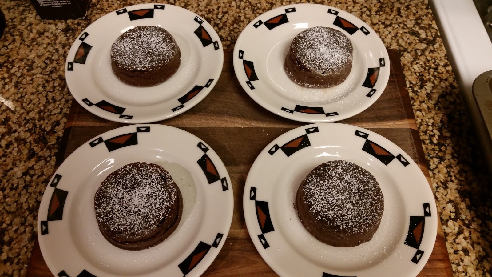
February's cake is a molten chocolate cake. One of the things I love about the recipe is that it make 4 individual cakes, perfect for having a couple friends over for dinner. It's also extremely simple and fast. The cakes bake in 12 minutes, and since you want to serve them warm, there is hardly any wait time. I made them after dinner on Friday night, and the whole process took about 30 minutes from initial prep to first bite.

Once I had the cakes placed on dessert plates, I sprinkled them with powdered sugar and topped them with a small scoop of vanilla bean ice cream. Delicious!

Edit: we just ate the remaining two cakes last night (they'll keep 5 days in a airtight Tupperware in the fridge), and I drizzled some caramel sauce over the top once I added the scoop of ice cream. Amazing! Caramel sauce and vanilla bean ice cream: that is definitely my recommended way to serve these.


Friday, February 12, 2016

Dissertation is available online

Hi Guys,
  A couple weeks ago ProQuest published my dissertation online.  Most institutional libraries will have access to it through a subscription to ProQuest's Thesis and Dissertations Database. 

  I also want to make it available to those that don't have access to a university library, so I am hosting it on Google Drive.

  If you would like to view/download a copy of "The relationship between oceanic transform fault segmentation, seismicity, and thermal structure," you can find a link to it here.

Sunday, February 7, 2016

The Ultimate Cake Baking Bucket List: A Monthly Cake Challenge

As one of my goals for 2016, I decided I want to expand my skills in the kitchen. I love baking, so why not find a way to challenge myself and make some tasty treats at the same time?

Enter the
Ultimate Cake Baking Bucket List. The list, which assigns a cake to bake for each month of the year, is designed to introduce the baker to multiple techniques while also, making them more confident and comfortable behind the stove. 

January's cake was a citrus angel food cake. I postponed making it until this weekend, as I thought it would be a fun activity to do while hiding out from the Super Bowl madness occurring just down the road from us (we're only 10 minutes from the stadium, and live right along the public rail line). 

One thing I noticed about some of the recipes on Food & Wine is that they don't list out all the steps, which can be a bit confusing. For example, the recipe for the angel food cake lists heavy cream and powdered sugar in the ingredients list. The directions never mention these ingredients though. From the picture and the ingredients themselves, it's obvious they want to make a simple icing to drizzle on the cake, but it would be nice if they mentioned that.

I followed the recipe almost exactly as it appears on the webpage, with a couple exceptions:
  1. My egg whites would not whip up into stiff peaks no matter how much I beat them in the KitchenAid until I added more cream of tartar. I believe this possibly due to the grated lemon zest preventing the egg whites from forming good structure.

    To over come this, I gradually added additional cream of tartar, approximately 1/4 teaspoon at a time. The recipe calls for 1 teaspoon, and it total I think I used about 2.5. One nice thing I learned, adding additional cream of tartar does not seem to affect the recipe at all. Yeah!
  2. The icing: the recipe mentions 2 tablespoons heavy cream and 1 cup confectioner's sugar. I used 1.5 tablespoons whole milk (I didn't have heavy cream), and 1/2 tablespoons homemade vanilla extract (I'll make a post later on how to make the extract). Once the cake was cooled and out of the pan, I just mixed up the icing with a metal whisk and drizzled it over the cake.

This cake is light, airy, and very delicious. The zest and fresh lemon juice really give the cake a nice pop of citrus flavor without making it tart. I was honestly surprised just how flavorful this cake was, as plain angel cake is so mild and generally a bit boring on it's own.

I did have some trouble getting the cake off the bottom of the pan, until I started cutting it. I used a non-stick angel food pan, but since angel food batter climbs the walls of your pan as it bakes, I am not sure how much the non-stick coating actually helps. I need to get a nice rubber or silicon icing spreader that I can also use to separate the cake from the pan for easy removal. You'll notice in my pics that the cake was still on the bottom part of the pan when I iced it. 


(sorry for the dirty pan in the pic, my husband had just sauteed some veggies)

Sunday, January 17, 2016

Learning QGIS - a simple tutorial

One of my goals for early 2016 is to learn how to use QGIS, a freely available open source Geographic Information System.

I have been an ArcGIS user for years, and consider myself fairly proficient. If you're a student and your university has a site license for ArcGIS, you can actually get a free personal license, good for one year from the date of install. The ability to have ArcGIS installed on my personal machine, and not having to rely on remote desktop connections, really helped facilitate my research during the last couple years. I have an Apple laptop, but I found that if I allocate sufficient memory (4 GB) and hard disk space to my Windows virtual machine, I can run ArcGIS quite happily. ArcGIS is extremely powerful, but it is also prohibitively expensive for many individuals and for small organizations, and is also Windows-only at this time. I am not sure where I will end up working at this time, and I certainly cannot assume I will have access to ArcGIS when I get there. As such, I feel that it behooves me to learn alternative solutions for any GIS needs I have.

QGIS provides many of the same powerful analysis tools as ArcGIS, thanks to its integration with other open source GIS tools, such GDALGRASS GISPostGIS, and MapServer.

GDAL is a translator library for raster and vector data, allowing you to transform your data into a number of different projections (coordinate reference frames) and data formats. It can generate hillshade, compute statistics on a grid file, etc.

GRASS GIS provides a lot of the analytical, modeling, and image processing tools found in QGIS. The difference between GRASS GIS and QGIS can be confusing as GRASS GIS can be also used as a standalone GIS. Earlier versions of GRASS did not include a GUI; commands were run via a command shell and results were displayed using the X11 windowing system. QGIS interfaces directly with GRASS to provide a nice user-interface, that folks already familiar with ArcGIS might be more comfortable with. Also, to my knowledge GRASS does not integrate directly with MapServer. Early versions of QGIS did not integrate with GRASS. Those early versions of QGIS could still handle a lot of GIS needs, but it did not have a lot of the analytical tools that GRASS did.

PostGIS brings geospatial capabilities to PostgreSQL databases, allowing you to run queries and perform database operations based off geometries, locations, etc. This tool is what provides QGIS with its database capabilities.

MapServer allows for the publishing of geospatial data on the web, and provides a suite of interactive mapping tools. QGIS uses MapServer to allow you to publish your maps to web.

The most recent version of QGIS (v. 2.12) brings together these individual tools, along with a number of others, in a nicely packaged open source software that is a serious competitor to ArcGIS.

My first project:

For my first project, I decided to create a map of the Discovery Transform Fault.


To create this image:
  1. I brought in an ASCII Grid file (.asc) of the bathymetry data, using Layer --> Add Layer --> Add Raster Layer. This brings the grid file in as a grayscale image.

  2. To change the color, double-click on the layer, then go Style --> Render Type --> singleband pseudocolor. Now you can select your colormap, choose between continuous and discrete modes, create classes, and adjust your bounds just as you can in ArcGIS.


  3. You can create the hillshade effect by going to Raster --> Analysis --> DEM. Under mode you will find options for computing slope, aspect, hillshade, etc. 


  4. Once your hillshade layer is created, move it down below your grid layer in the layers panel. Then, go to Layer Properties for your grid, and set a transparency so you can see the hillshade through the data. 

  5. The plate boundary line that you see on the map was brought in as a geotiff. To make the white background transparent, you go to Layer Properties --> Transparency and set the RGB values to 255.


  6. Next I added the earthquake data, the purple circles that are sized by magnitude. The earthquake data was in a comma-separated file (.csv) so I went to Layers -->Add Layer --> Add Delimited Text Layer.

    QGIS does a great job of reading the file and determining that the first row of data is actually the header row. I simply selected which columns represented the X field and Y field and clicked OK. It then asks you to choose a Coordinate Reference System (CRS) for the data. Select the appropriate projection, hit OK, and the data should show up on your map.

    To size the points by magnitude (you can also color by attribute as well), double-click the layer to bring up Layer Properties --> Style and change Single Symbol to Graduated. Under Method, select size, and for Column, select the attribute (in my case "Mw") that you want to size by. Now you can choose what mode to break by (equal interval, natural breaks, pretty breaks, etc.).

    As with any context menu, you can hit "apply" before you hit "OK" to see how the data will look before you completely exit the menu. 


  7. Now that we have all the data in QGIS, it's time to make the actual map. First, hit the New Print Composer icon (white rectangle w/ yellow asterisk) or go to Project --> New Print Composer.

  8. Select Layout --> Add Map, and then drag using your mouse or trackpad to draw a box where you want the map to appear. Once you let go on the mouse or trackpad, your data will pop into view. You can adjust the visible bounds of your data under Item Properties.


  9. Under Item Properties for the Map object, you will also find options for adding a geographic grid, or graticule, as I did above.

  10. The Add Scalebar and Add Legend options are tucked away under Layout. Each time you choose to add an item under Layout, you'll need to draw a box on your map so the composer knows where to place it. You can always move these items after the fact.

  11. If you do not want all your layers to show up in the legend, simply uncheck Auto Update under Item Properties and the select the layer you wish to remove and hit the minus icon. The icon of the pencil on the paper allows you to edit the names of the visible layers.  The legend item has a "columns" option under Item Properties. This will enable you to have your layers added side-by-side, versus stacked vertically. The icon that looks like a funnel with filter the legend by map content. For my map, this meant that for certain sized earthquakes not visible in my map extents, the corresponding legend entry was removed.


  12. before filtering legend for map content

    after filtering legend for map content

  13. Once you have your map the way you want it, you can easily export it as an image, PDF, or SVG file.

One thing I noticed was that even though I used a continuous colormap for the bathymetry data, the legend shows the colorbar as discrete color blocks. It would be better show a gradual change in color from blue to red. When you first set the colorbar for the layer, the icon for the spectral colormap does show this gradation of colors, so this should be something QGIS can do. I haven't looked into this too much yet, but if I find a solution, I'll post about it.


For a lot of helpful QGIS tutorials, complete with downloadable datasets so you can easily follow along, check out www.qgistutorials.com. They start out with tutorials on basic map-making and go all the way through advanced statistical analyses of your data. It's a tremendously useful site if you really want to learn QGIS.

Thursday, January 7, 2016

AGU and Post Docs

Well, my re-dedication to my blog hit a brief snafu as AGU ended up being crazy as usual and last minute postdoc applications (*fingers crossed*) took up the rest of my time.

AGU was fun, as always, and completely crazy due to the sheer number of talks and posters, as usual. It was great to meet up with friends, catch up with colleagues, and, of course, catch some great talks and posters.

I presented a poster on my global characterization of mid-ocean ridge transform fault structure and the relationship between fault segmentation and the underlying fault thermal structure, which controls the width of the seismogenic zone. You can view and download a high-res PNG version of my poster here: AGU poster.

Below is a low-res screen grab:


It is stuff I have presented before as preliminary results, but the work is now finalized. I have been working on my global characterization of fault structure for a few years now, updating it as new versions of global bathymetric grids become available. My committee and I decided to hold off on publishing it until we finalize the scaling relation work, as combining the two makes for a much stronger paper. Of course, all of this is now published in my dissertation. Writing this all up for publication in a journal will be one of my top goals over the next couple of months.

Speaking of my dissertation, a link to the PDF document be found here: Dissertation. ProQuest has the final version, and once it is officially published online, I'll write a new post and include the direct link.

Oh, due to said postdoc applications, my AGU poster ended up being put together much later than anticipated. I ended up using AGU's own poster printing services provided by Copy Central. For $119, I received a high-res full color 3' x 5' poster printed on heavyweight paper. It looked amazing, and for the convenience of picking it up at the conference the morning of my presentation, it was worth every penny. I highly recommend their services.


Tuesday, December 15, 2015

Long Time, No Blog


Well, it has been a LONG time since I have posted on my blog, ~ 2.5 years. I did not even realize it had been that long until I checked this evening.

A lot has happened over the last 2.5 years, here are a just few examples:
  • Just this past October I successfully defended my Ph.D. at the University of New Hampshire. My dissertation is entitled "The Relationship Between Oceanic Transform Fault Segmentation, Seismicity, and Thermal Structure." I'll post a link to it once it's available online, and I'll include the abstract below
  • In September, 2014 my first paper related to my PhD research was published:
    Wolfson-Schwehr, M., Boettcher, M.S., McGuire, J.J., and Collins, J.A., 2014, The relationship between seismicity and fault structure on the Discovery transform fault, East Pacific Rise: Geochemistry, Geophysics, Geosystems, v. 15, no. 9, p. 3698–3712, doi: 10.1002/2014GC005445.
  • On October 23, 2013 I gave a talk at the USGS Menlo Park. I admit that standing up on the podium, in front of all the flags and facing many of my committee chair's colleagues (she was a Mendenhall Fellow there), was a bit intimidating. Everyone there was very welcoming, however, and I really enjoyed the day. The talk is available to watch online here
  • On October 30, 2015 I gave my second web-streamed talk at the University of Texas Institute of Geophysics. This was my first post-defense talk, and it was definitely more relaxed than many of my others. It was quite fun to be flown down from northern Cali for a couple days and to get to tour the facilities and meet with many of the researchers. This talk is also available online, and can be watched here.  
  • In 2013 I co-convened my first AGU session on oceanic transform faults, and in 2014 I did it again! It was really nice to be able to bring the oceanic transform fault community together, and we're hoping to make this a biennial occurrence. 
  • And, on a personal note: In Aug. 2014, I gave birth my son, Lincoln. He's our first child, and such a joyous addition to our family. 

So that pretty much catches you up on all the major things I believe. I know I have said this before, but I am going to recommit to this blog once again and try to update on a regular basis. It's AGU week now, so that should give me some good material to blog about.

Oh, and here is the abstract for my dissertation:

ABSTRACT
THE RELATIONSHIP BETWEEN OCEANIC TRANSFORM FAULT
SEGMENTATION, SEISMICITY, AND THERMAL STRUCTURE
by
Monica Wolfson-Schwehr
University of New Hampshire, December, 2015

Mid-ocean ridge transform faults (RTFs) are typically viewed as geometrically simple, with fault lengths readily constrained by the ridge-transform intersections. This relative simplicity, combined with well-constrained slip rates, make them an ideal environment for studying strike-slip earthquake behavior. As the resolution of available bathymetric data over oceanic transform faults continues to improve, however, it is being revealed that the geometry and structure of these faults can be complex, including such features as intra-transform pull-apart basins, intra-transform spreading centers, and cross-transform ridges. To better determine the resolution of structural complexity on RTFs, as well as the prevalence of RTF segmentation, fault structure is delineated on a global scale. Segmentation breaks the fault system up into a series of subparallel fault strands separated by an extensional basin, intra-transform spreading center, or fault step. RTF segmentation occurs across the full range of spreading rates, from faults on the ultraslow portion of the Southwest Indian Ridge to faults on the ultrafast portion of the East Pacific Rise (EPR). It is most prevalent along the EPR, which hosts the fastest spreading rates in the world and has undergone multiple changes in relative plate motion over the last couple of million years. Earthquakes on RTFs are known to be small, to scale with the area above the 600C isotherm, and to exhibit some of the most predictable behaviors in seismology. In order to determine whether segmentation affects the global RTF scaling relations, the scalings are recomputed using an updated seismic catalog and fault database in which RTF systems are broken up according to their degree of segmentation (as delineated from available bathymetric datasets). No statistically significant differences between the new computed scaling relations and the current scaling relations were found, though a few faults were identified as outliers. Finite element analysis is used to model 3-D RTF fault geometry assuming a viscoplastic rheology in order to determine how segmentation affects the underlying thermal structure of the fault. In the models, fault segment length, length and location along fault of the intra-transform spreading center, and slip rate are varied. A new scaling relation is developed for the critical fault offset length (OC) that significantly reduces the thermal area of adjacent fault segments, such that adjacent segments are fully decoupled at 4OC . On moderate to fast slipping RTFs, offsets 5 km are sufficient to significantly reduce the thermal influence between two adjacent transform fault segments. The relationship between fault structure and seismic behavior was directly addressed on the Discovery transform fault, located at 4S on the East Pacific Rise. One year of microseismicity recorded on an OBS array, and 24 years of Mw 5.4 earthquakes obtained from the Global Centroid Moment Tensor catalog, were correlated with surface fault structure delineated from high-resolution multibeam bathymetry. Each of the 15 Mw 5.4 earthquakes was relocated into one of five distinct repeating rupture patches, while microseismicity was found to be reduced within these patches. While the endpoints of these patches appeared to correlate with structural features on the western segment of Discovery, small step-overs in the primary fault trace were not observed at patch boundaries. This indicates that physical segmentation of the fault is not the primary control on the size and location of large earthquakes on Discovery, and that along-strike heterogeneity in fault zone properties must play an important role. 


Friday, May 3, 2013

Reordering columns/rows in a shapefile in ArcGIS

I recently created a shapefile in ArcGIS of my oceanic transform fault data. I started off with two separate files: a shapefile of points that simply contained a latitude/longitude and name for each fault; and a polyline shape file that contained the length measurements and the start/end points. I combined these two shapefiles in ArcMap using the "Join Data" command, and selecting to join the data based on spatial location. The result was a single polyline shapefile, that included all the original polyline attributes as well as all the related attributes (name, center lat/long) from the point file.

The problem was that the shapefile was not ordered the way I wanted it. In ArcMap you can reorder rows by ascending/descending values by double-clicking on the column header, or move columns simply by clicking on the header and dragging it over. The problem is that this only applies to your view of the shapefile attribute table, and the reordering is not actually saved to the shapefile itself. If you close out ArcMap, open a new map, reimport the shapefile, everything is back to the original order.

There is a free plugin tool for ArcGIS that is quite powerful and can solve these issues for you: ET GeoWizards. There are both free and paid versions of this toolbox, but I found the free version did exactly what I need. This toolbox is pretty impressive, and includes tools for feature translation, where shapefile objects are moved by a user-specified distance, filling holes in polygons, generalizing features, creating clusters from points, and a whole suite of other functions.

In order to reorder the columns and sort the rows in your shapefile, you can find the necessary commands under "Basic." The "Order Fields" command lets you select which fields you want to use from your original shapefile and specify the order in which they should appear. The "Sort Shapes" command lets you select which columns you want to sort the data by (you can select more than one), and whether you want them in ascending or descending order.


Another great toolbox plugin for ArcMap is Jenness Enterprises' Tools for Graphics and Shapes.  If you are looking for a tool to calculate spheroidal (geodesic) length of features in your shapefile, this is the tool for you. While this toolbox includes many of the same functions as the GeoWizards plugin, it also has many unique tools as well.  I have found that having both toolboxes has made working in ArcMap a much more pleasant experience. I wrote up a blogpost on the Tools for Graphics and Shapes plug-in back in 2010.


Thursday, May 2, 2013

Negotiating a Postdoc Position

UPDATE: The webinar link has now been posted. You can view the webinar yourself here.

On Tuesday evening, April 30th, COSEE (Centers for Ocean Sciences Education Excellence) and IBP (Institute for Broadening Participation) co-hosted a webinar :

“How to Negotiate Your Postdoc Position”

The panel speakers included Dr. Ashanti Johnson (Pyrtle), the executive director of IBP, whom I know from the University of South Florida, where she was faculty member when I was a master's student, and Dr. Edward Krug, Assistant Dean for Postdoctoral Affairs and an associate professor at the Medical University of South Carolina.

The webinar focused on how to negotiate your postdoctoral position in order to make your experience the best one possible. This does not just include salary negotiation, which is frequently a moot point anyway since funding is often provided by grants and is fixed, but also start date/end date, teaching load, student advising, publications, expectations, etc.

I took notes during the webinar and thought I would post them here in case they might be a benefit to others. The webinar also mentioned a few online documents and resources for students to help them in finding and negotiating a postdoctoral position, which I will post below.

1) PDF document: NEGOTIATING A POSTDOC POSITION

2) Pathways to Science, an IBP program that seeks to help connect underrepresented groups to careers in STEM fields, lists a whole bunch of programs from K-8 grade levels all the way through faculty positions. Their listing of postdoc programs is quite extensive. They also provide tips on how to prepare and enhance your application, questions to ask before you start, and links to past webinars (the webinar I just attended should be posted there within the next week). While the primary aim of the program is to help bridge the gender/race/ethnicity gap in science, the website is a great resource for everyone.

3) The National Postdoctoral Association, which seeks to provide a "national voice and seeking positive change for postdoctoral scholars." The website provides a lot of resources to students and current postdocs, including listings of current and upcoming positions, guidelines for responsible conduct in research, and access to a network of current and former postdocs and mentors, research universities, and industry companies. Membership is required to access the majority of their content, and the annual dues amount varies according to your position (student, post doc faulty member, etc.).

Below are the notes I took while each presenter was speaking. I have also included a summary of the  questions and answer portion of the webinar.


Ashanti Johnson:

  • you are encouraged to negotiate your first salary 
  • can negotiate full compensation package including research support, benefits, etc., not just salary
  • always start off by responding how pleased you are to receive the offer and ask for a written confirmation of the offer. Confirm with them how long you have to make your decision as to whether or not to accept
  • You should convey enthusiasm the whole time, especially throughout the negotiation process
  • Get final offer in writing after all compensations have been made
  • If you reject the position, remember that these are still potential future colleagues and maintain professionalism and enthusiasm throughout

Edward Krug:

  • Grad school versus Post Doc
    • grad school is really focused on how to address problems while postdoctoral positions show you how to identify and address critical gaps in current knowledge. Survival skills for scientists
  • Fundamental science post docs - NSF is primary funding agency
  • National Postdoctoral Association - professional tools - www.nationalpostdoc.org - helps develop core competencies that postdocs should learn during their tenure:
    • Discipline-specific conceptual knowledge
    • research skill development
    • communication skills
    • professionalism
    • leadership and management
    • responsible conduct of research
  • NIGMS IRACDA Program - for biomedical/behavioral scientists. You apply to the program, not a specific person. You teach 25% of your time. Good for want-to-be academics. Includes a yearly conference. Typically 2 - 3 years
  • MyIDP - My Individual Development Plan - aims to help you find the ideal career position once you have completed your PhD. The website gives you means of self-assesment and then fits you with a possible career match (e.g. being a PI). Once matched, the program:
    • provides you with a list of strategic goals to help you achieve your desired career path
    • help you identify possible your weak points towards achieving your goals
    • gives you access support groups of people with similar goals/challenges
  • Publications are the currency of academia. The majority of postdocs end up in some type of publication disputs with their advisor. So what makes a coauthor versus first author?
    • you should discuss this openly and agree on set guidelines with your advisor from the get-go
    • ask about authorship BEFORE joining a lab. Don't assume your mentor will put you first

Questions from the crowd:

   Q: Can you do something else while doing a post doc - non-profit work that fits in with your career?
        A: maybe 25% of time, but don't let it compromise your Post Doc

   Q: If you want to pursue an Industry position, should you pursue a post doc?
        A: Yes. NSF has an industry/academic program. Post docs can really help you get the ideal position.

   Q: Are salaries generally negotiable?
        A: If funding is through a grant, it may be fixed. You need to research the funding source before trying to negotiate a salary. Some institutions have a post doc office that can help you negotiate your post doc salary.

   Q: Can you take your post doc research with you?
        A: Yes, under some circumstances. You can discuss this with your mentor at the beginning. It may also depend on who the funding was awarded to.

   Q: What are the options for foreign post docs studying at US institutions?
        A: NSF and some institutions have foreign postdoc positions, but not NIH

   Q: When do you inform your advisor of your post doc plans?
        A: It really depends on the relationship you have with your advisor and whether or not you can have an informal conversation about it. Remember, they decide when you're done, not you

   Q: Can you apply for a post doc doing the same thing as your PhD?
        A: Similar is fine, but having a post doc that is different is advantageous to learn new skills. NSF actually encourages you to pursue different, but related topics

   Q: If papers are submitted, but not published, can you still look for a post doc?
         A: Yes! Do not wait. Look often and look early.

   Q: What kind of negotiating power do I have as a first time post doc?
         A: Depends on the position, but you should definitely be your own advocate. There is a new government recommendation of starting salary of 42K for postdoctoral scholars, so use that as a starting off point if you are going to negotiate salary

   Q: How many publications per year is expected?
        A: 1 - 1.5 per year is good, at least in biomedical research fields. Some clinical positions expect 3 - 4 publications per year. Expectations are really dependent on the specific field you are in.

   Q: How does research vary between post doc and PhD
         A: You are now a professional, and this should be reflected in the quality of your work and publications. There is less structure, more self-guided. You have one primary mentor, not a whole committee.
               It is what you make of it, so you need to be able to productive on your own and not be dependent on others. Do not be afraid to go out and seek more mentors that can help coach you professionally and personally as you move through your career. These mentors can help you throughout your post doc and beyond.

    Q: So how do you find those other mentors?
         A: Professional societies can be a great source
              Your PhD advisor can become a lifelong mentor. You are now part of their lineage, and they want you to succeed. If there is someone whose work you are interested in, talk to them. They can become a mentor. Networking is key.


Monday, April 22, 2013

The Iran and China earthquakes as captured by the UNH seismometer

This past week has been has been a tense one for sure. Not only was there the Boston Marathon bombings and the fertilizer plant explosion in Texas, but there were also major earthquakes in both Iran and China.

The 7.8 magnitude event in Iran occurred on April 16th, near the Iran/Pakistan border. Pakistan bore the brunt of the quake, with at least 35 dead and an entire town essentially destroyed. You can view all the scientific/technical details of the event on its USGS page. We can see the earthquake quite clearly on the UNH seismometer. The event hits our station at 10:56 UTC (06:56 am EST). The shaking intensity when the surface wave hits is strong enough that the seismic wave looks clipped in the display (in green).


The magnitude 6.6 earthquake in China struck on April 20th. Although smaller than the Iran earthquake, this earthquake was very shallow and hit a more densely populated area. The latest estimates put the death toll at 188, with over 11,000 people injured and many are still missing. The USGS page for the event can be seen here.

It takes about 13 minutes for the initial P-wave from the earthquake to reach our station, and you can see when it hits if you look at the top black line. Just after the 30-minute mark on the same line, you can see the S-wave hit. The much larger amplitude surface waves can be seen in red, starting about 21:03 EST.


These earthquakes have devastated the villages they have hit, particularly the one in China. Construction in these small towns is often very old and not up to code. Landslides bury entire structures and block roadways, making it hard for aid to get to those who need it the most. 

My thoughts go out to everyone affected by this past's weeks events, both here in the US and abroad.

The UNH seismometer is part of the larger New England Seismic Network. You can visit their page here.

Saturday, April 20, 2013

Proposing a session on oceanic transform fault and intraplate environments at AGU!

Last year, while I was presenting my poster at the AGU Fall meeting, I realized that there is a small, but dedicated community of folks that study fault zone structure and processes related to oceanic transform faults. I had only met a few of them, but I wanted to do something to facilitate bringing everyone together for discussion and possible collaboration. I decided that I was going to propose an AGU session that specifically focused on oceanic transform fault research. I started off by talking to some other folks at the conference about it to gauge interest, and everyone I mentioned it to seemed pretty keen about the idea. Encouraged by the level of interest, I decided to move forward.

A friend of mine, Kasey Aderhold, is a PhD student at Boston University. Her research looks at strike-slip earthquakes in the ocean, both in the intraplate regions and along fracture zones. We decided to team up and propose a joint session, along with our respective advisors. We are pretty stoked about it, and hope that this session is successful in bringing everyone together. It will also be an invaluable experience for us, as students, to be able to convene an AGU session. Our advisors are both influential women in the field, and while I have nothing against all the male geophysicists out there, I am proud that our session is all woman-powered. 

We won't know until June if our session has been approved, but our fingers are crossed. If you know anyone who studies fault structure and/or seismicity in the ocean, feel free to share this with them. The more the merrier. It would be very exciting if we had enough abstract submissions to our session that we can have both a poster and oral session.


Saturday, April 13, 2013

Detecting Earthquakes at UNH

I've decided a great way to get back into blogging would be to show some of the great seismograms the UNH seismometer has been recording since we set it up in 2011.

While most of the signals we record on the station are from passing trains, we have also recorded some pretty impressive earthquakes.

Check out this seismogram from an earthquake swarm near the Solomon Islands on Feb. 8, 2013. In a little over 40 minutes, there were 3 large earthquakes. A magnitude 8.0 struck at 1:12 (UTC), followed by a 7.1 event 11 minutes later, and a 7.0 event 30 minutes after that. In addition, there were smaller magnitude 5's and 6's both preceding and succeeding these larger events. When the surface waves from the 7.0 event hit our station, surface waves from the preceding 7.1 and 8.0 event were already shaking it. In the image below, the signal is so strong that it actually goes off the page!


Remember the Colorado and Virginia earthquakes that occurred back in August of 2011? The UNH
seismometer captured those earthquakes as well:


While we are looking at more local events, let's not forget the small Maine event (magnitude 4.0) that occurred on Oct. 16 of last year. See that impuse response in green at the bottom of the chart in the image below? Well, that's it. The earthquake occurred very close to our station, so the P, S, and surface waves hit at nearly the same time. The response that we see in the long-period signal, therefore, is very sharp. I have to admit, I was quite excited when this earthquake occurred. This was the first earthquake that I really felt and realized what it was while it was occurring -- well, truth be told I first thought my furnace was about to explode, but only for the first second or two. In fact, I not only felt the earthquake, but I heard it. I actually heard the earth rumble.


Finally, let's look at a seismogram from a magnitude 6.9 earthquake that occurred on Feb. 02, 2013 in Japan. This is a great seismogram because we can clearly see when the P, S, and surface waves arrive at the station.


Pretty cool, eh? If you want to check out some seismograms for yourself, you can do so at the New England Seismic Network webpage. To view the UNH stations, click on current seismograms and select DUNH as the station.


Saturday, April 6, 2013

Still Alive!

So I know it has been a while since I have posted anything to my blog, but I was a bit shocked to learn that "a while" is actually almost 2 years.

In the past 2 years a lot has happened:

  • I passed my departmental exams and advanced to candidacy
  • I sailed as member of the scientific party on IODP Expedition 343: Japan Trench Fast Drilling Project (JFAST).
  • I was selected to participate in a NASA Social, during which I was able to go to the Jet Propulsion Laboratory in Pasadena for the landing of Curiosity, the Mars Science Lab rover
  • I got married to Kurt Schwehr, who is much better about updating his blog than I am mine
In the next year, I'll be wrapping up my research and getting ready to defend. As I do so, I am going to make an effort to keep my blog updated. 

I realize that not only has my blog been helpful to me, as I have often referred back to it to remember how I did something, but that it has also been helpful to others as well. Having something that I posted save someone else a lot of grief and head-banging is pretty sweet, and I hope that some of my future posts will continue to be beneficial to people.
So buckle up and hang on to your hats folks, here we go....

Tuesday, May 17, 2011

UNH now has a seismometer!

On Friday, April 29th, Mike Hagerty, from the New England Seismic Network came up to UNH to help us install our very own seismometer. It is installed in the basement of James Hall in a vault that has been dug out beneath the building:

The seismic vault in the basement of James Hall

Our location in New Hampshire means we don't have to dig very deep to hit bedrock, and so the vault is only a couple feet deep. The seismometer sits in the vault, coupled to the bedrock, while the data cables are kept safe and secure in the PVC pipe running from the vault to the cabinet. The seismometer is a Trillium 120 P with a RefTek 130 broadband seismic recorder.


Reftek 130 seismic recorder
Trillium 120P seismometer


We still have to properly align the seismometer so that its north axis is actually pointing north, but in the meantime we can have some fun looking at the data. James Hall is located rather close to the train tracks; fortunate for those wishing to take the train, but unfortunate for seismometers (unless you wish to study seismograms of passing trains). Below is a high-frequency seismogram from our station, the big spike in blue is a passing freight train:

click to see full-size

You can also see when the building's HVAC system kicks in. This means that eventually we'll probably try to find the UNH seismometer a new home, so that we don't have to worry about local small earthquakes getting lost in the noise of trains and building maintenance.

The nice thing is that building noise and passing trains get filtered out when you just look at the long-period signal. This is excellent for looking at teleseisms (a tremor cause by an earthquake more than 1000 km from the station). Below we can see two teleseisms in the seismic recordings from 5/15/2011:

click to see full size

The spike in red is a teleseism from a Mw 6.0 earthquake (event time = 13:08 UTC) located on the St. Paul transform fault system in the mid-Atlantic. The much larger teleseism in green -- if you look you can see that it actually starts in blue around 18:57 and continues on through the black wave until about 20:55 or so -- is from a Mw 6.5 quake off Papua New Guinea. The Papua New Guinea quake occurred at 18:37 UTC, but it took about 20 minutes for the first p-waves to hit our stations. The s-waves appear kick in around 18 minutes after the p-waves, and the surface waves start to hit at 19:37, a full hour after the event time. This may seem like a long time, but remember that seismic waves can take a while to travel through the earth, particularly as they reflect and refract through different layers in the earth's mantle. Surface waves take the longest to arrive, as they alternatively speed up and slow down through different surface materials such as rock, sand, soil, etc. The chart below gives an estimate of travel time for various seismic waves versus angular distance from the earthquake:

source: http://geophysics.eas.gatech.edu/classes/Geophysics/misc/Seismology.html

If you wish to check out the seismograms that are being generated by the UNH seismometer, or any of the New England Seismic Network (NESN) stations, check them out here. You can select DUNH from the station drop-down list and check out the seismograms for any day since the seismometer was successfully installed. If you click on station list, you can see all the stations in the NESN. If you want to hunt for teleseisms, check the period to long-period. If you think you've found one, you can go to the USGS Earthquake page (http://earthquake.usgs.gov/earthquakes/recenteqsww/) and see if you can find a matching event. Large earthquakes greater than Mw 5.5 usually generate teleseisms that most modern seismometers anywhere in the world can see. You can also use the above chart to figure out how long after the event you should see seismic waves arriving at the station.

UPDATE:  Kurt Schwehr just blogged about the UNH seismometer as well. He talks about network setup and how we initially configure the seismometer with a Palm Pilot. He also shows the results of a jump test.

Tuesday, January 4, 2011

How to fix PostBox email client preferences

I use Postbox 2.1 for my email client on the Mac. It is efficient, has advanced searching, and let's you view photo thumbnails, attachments, and todos from any folder and directly export them to another program. This makes finding that lost attachment somewhere on the server very easy.


I recently encountered a problem, however, where despite having set the account-specific preferences to not quote the original email in a reply, it was doing it anyway. No matter what I did or tweaked, Postbox would automatically included the quoted message. It was pretty annoying, as I had to delete everything manually, and for emails that include a lot of HTML that can be a pain. So if you have issues with your Postbox preferences too, you can do what I did ($ refers to command link prompt in the terminal)

  1. Make sure preferences are set to how you want them to behave (e.g. quote message  on reply box in unchecked) and the close Postbox.
  2. Navigate to the Postbox preference file location:  $ cd /Users/username/Library/Application\ Support/Postbox/Profiles/random_characters.default/
  3. save a backup: $ cp prefs.js prefs.js.backup
  4. open prefs.js (I just did $ open prefs.js to open it in xcode)
  5. if your problem is quoting on reply, find the: user_pref("mail.identity.id4.reply_quoting_style", 2)  and set it to user_pref("mail.identity.id4.reply_quoting_style"0)
  6. save the file and reopen Postbox and it should be fixed

You can scroll through and pretty easily figure out what the different preferences are from there name, just be sure that you have a backup in case you mess something up. Worst case scenario you just rename your prefs.js.backup back to prefs.js and you're good to go